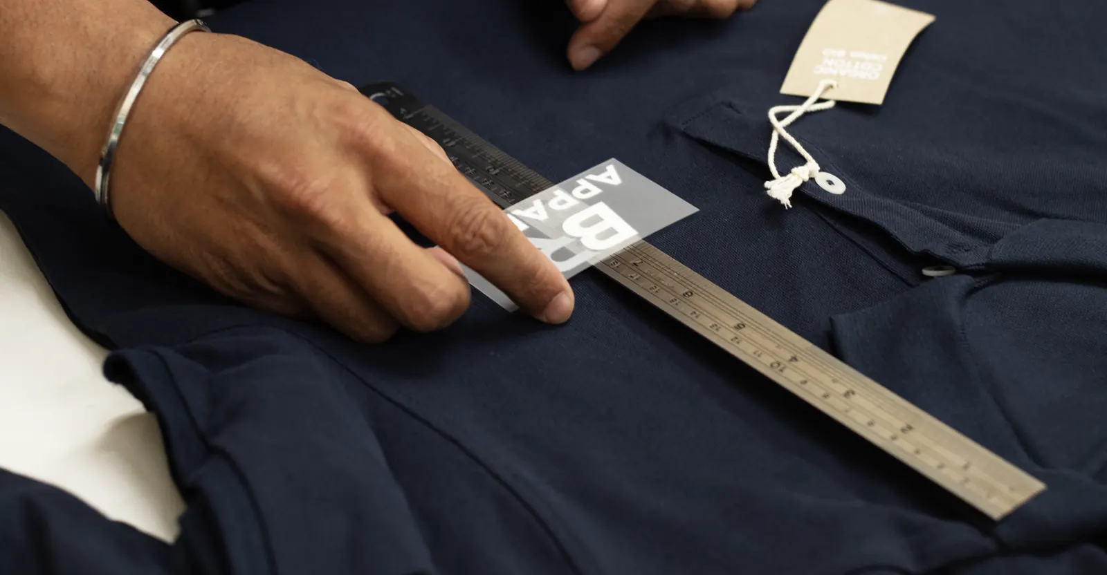
Logo Placement and Size Guide
Where a logo should go on branded workwear, how wide it should be, and the placement mistakes that only become obvious once the garments are worn.
Three Questions, Not One
Most people ordering branded workwear say "left chest" and stop there. It is usually the right answer, but it is one answer to three separate questions, and the other two are where orders go wrong.
Where will it actually be seen? Not on the garment, on the person, doing their job. A logo that reads perfectly on a flat polo can spend a whole shift behind an apron, under a lanyard or inside a folded arm.
How big before it stops working? Every logo has a size below which the detail collapses, and for embroidery that floor is higher than people expect.
And what covers it? Aprons, lanyards, fleeces, hi-vis. The layer you brand should be the layer that is on show.
Standard Placements and Sizes
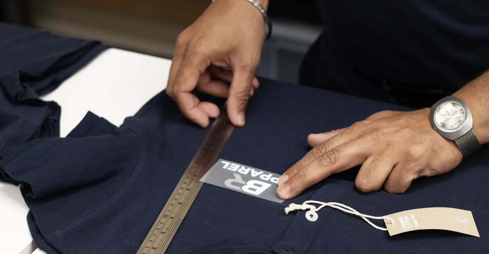
These are the typical ranges used across branded workwear and uniform. They are a starting point rather than a rule: the right figure depends on the garment, the shape of your logo and the size being made, and we confirm it on a proof before anything is produced.
| Placement | Typical width | Where it sits | What it is for |
|---|---|---|---|
| Left chest | 70 to 90mm wide | Centred on the left chest, sitting below the collarbone rather than on it | The default for almost every uniform. Reads clearly at conversational distance without dominating the garment. |
| Right chest | 70 to 90mm wide | Mirrored from the left | A second mark, a site or department name, or the main logo moved across when a lanyard or apron sits over the left. |
| Upper sleeve | 60 to 80mm wide | On the outer arm, below the shoulder seam | Secondary branding, and the usual answer on hi-vis where the chest is taken up by certified material. |
| Cuff or lower sleeve | 50 to 70mm wide | Above the cuff edge, on the outer arm | Understated, and popular on shirts and knitwear. Disappears entirely if staff roll their sleeves, which is worth knowing first. |
| Back neck | 50 to 80mm wide | Centred below the collar seam | A small brand mark on a garment you want to feel retail rather than corporate. Often paired with a left chest logo. |
| Full back | 250 to 300mm wide | Centred below the collar seam, above the natural waist | Print rather than embroidery. Site visibility, event kit and anything that has to be read across a car park. |
| Cap front | 50 to 60mm wide | Centred on the front panel | Embroidery only. A structured cap front will not take a heat pressed transfer evenly. |
| Apron bib | 100 to 150mm wide | Centred on the bib, above the pocket line | Hospitality. This is the placement that carries the branding once an apron covers the polo underneath. |
A wide, landscape logo and a tall, square one at the same width look nothing alike on a chest, which is why width alone does not settle it. Send us the artwork and the garment and we will come back with a placement drawn to scale.
The Logo Should Not Scale With the Garment
This one surprises people. It seems logical that a 4XL polo should carry a bigger logo than an XS, in proportion. In practice that is what makes a team photograph look wrong.
A uniform is seen as a group. When eight people stand together, the eye compares the logos to each other, not to the garments they are on, so eight different logo sizes read as a mistake even though each one is individually correct. Keeping a single width across the whole size run is what makes the set look deliberate.
The exception is genuinely small garments, children's sizes and some ladies fit cuts, where a standard width would crowd the panel. We reduce those and tell you we have done it, rather than silently shrinking half the order.
How Small Is Too Small
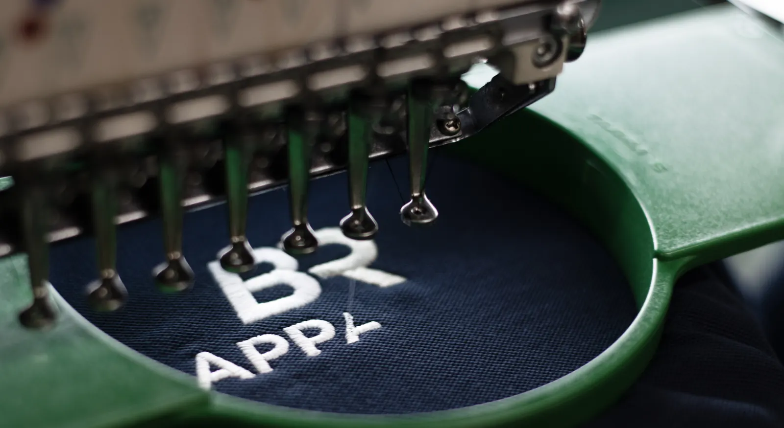
Embroidery has a hard floor, and it is a physical one rather than a preference. A stitch has a minimum width, so below roughly 5mm of letter height characters start losing their shape, and strokes thinner than roughly 1mm tend to fill in and disappear. No amount of care at the machine gets round it.
In practice this bites on straplines. A logo with a company name plus "quality since 1979" underneath will hold at 90mm on a chest and turn to mush at 55mm on a cap. The fix is a second version of the artwork with the strapline removed for the smaller placements, which is worth preparing once and keeping.
Print does not have the same floor. A DTF transfer holds fine detail, gradients and small text that embroidery cannot, so a genuinely detailed logo at 60mm is a print job rather than a stitching job. The embroidery versus printed logos comparison sets out the rest of that trade-off.
Six Placement Mistakes We See
None of these are unusual and most of them only become obvious once the garments are on people, which is too late. All six are avoidable in the thirty seconds it takes to ask the question.
Too high, so it rides onto the collarbone
The most common error by a distance. A logo that looks right laid flat on a table sits too high once the garment is on a person, because the shoulder takes up the top of it. Placement is judged worn, not flat.
Too low, so an apron or a folded arm covers it
Front of house staff spend the day behind a bib apron and with their arms folded or holding a tray. A low chest logo is invisible for most of a shift. Move it up, or brand the apron instead.
Straight underneath a lanyard
Reception, events and anywhere with ID badges. The lanyard hangs exactly where a left chest logo goes, and it wins. Worth checking before you commit rather than after.
Across a seam, a pocket edge or a zip
Embroidery needs a flat, evenly tensioned area to hoop. A placement that crosses a seam or a pocket edge distorts, and a placement across a softshell chest zip cannot be done at all. This is the classic softshell mistake.
Over hi-vis reflective tape or fluorescent panel
Not just untidy, it reduces the certified area a hi-vis garment is approved on and can take it outside EN ISO 20471. On hi-vis the placement is dictated by the garment, not the artwork.
Branding the layer nobody sees
If the team wears a fleece over a branded polo all winter, you have paid to brand something invisible for half the year. Brand the outer layer, or brand both and accept the cost.
For hi-vis specifically, the placement is set by what the garment is certified on rather than by preference. The hi-vis clothing guide covers how the classes and minimum areas work.
Nothing Gets Stitched Before You See It
Placement is the part of an order that is easiest to get wrong and hardest to undo, so it is signed off rather than assumed.
Your logo is digitised once
Embroidery needs the artwork converted into a stitch file, sized for the placement it is going on. That is a one-off £15 charge on a first order, and the file is then held on record for everything after it.
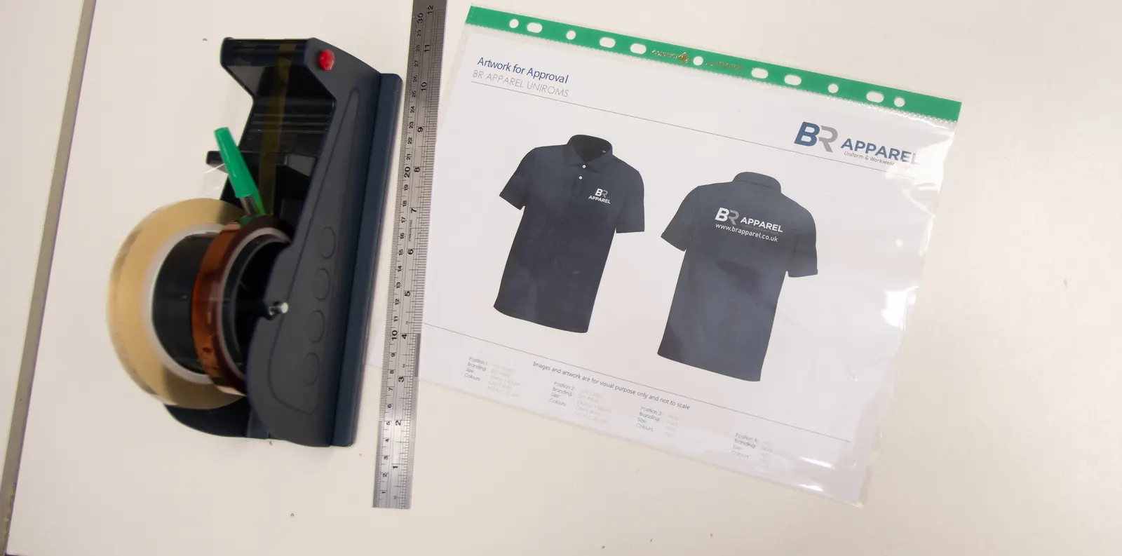
You get a proof with the measurements on it
Size and position, on the actual garment, before production starts. If it looks too high or too small on the page, it will look the same on the garment, so say so then.
The spec is kept, so re-orders match
Placement, size, thread colours and garment codes all stay on file. A replacement polo in eighteen months carries the logo in the same place at the same size as the original batch, which is the whole point of a uniform.
Branding is produced in house at our Bradford facility. For the embroidery side in detail see embroidery in Bradford, and for specifying a uniform from scratch, the uniform buyers guide.
Send the Logo
and We Will Size It
Tell us the garment and what your team actually does in it. We will come back within 24 hours with a placement, a size and a method, and say so if your artwork needs a second version for the small ones.
Request a QuoteLogo Placement FAQs
Typical sizes, where a logo sits on each garment, and what embroidery can and cannot hold.
- A left chest logo on an adult polo is typically 70 to 90mm wide. The exact figure depends on the shape of your logo, because a wide landscape mark and a tall square one at the same width look nothing alike on a chest. It also depends on how much detail the artwork carries. We confirm the size on a proof against the actual garment before anything is produced.
- Centred on the left chest, sitting below the collarbone rather than on it. The most common mistake is placing it too high, because a logo that looks right on a garment laid flat sits too high once it is worn and the shoulder takes up the top of it. Placement should be judged on a person, not on a table. If your team wears bib aprons or ID lanyards, both of those land exactly where a left chest logo goes, so it is worth moving the logo or branding the apron instead.
- Up to a point, and the limit is physical rather than a preference. A stitch has a minimum width, so below roughly 5mm of letter height characters start to lose their shape, and strokes thinner than roughly 1mm tend to fill in. Straplines are where this bites: a logo with a company name plus a line underneath will hold at 90mm on a chest and turn to mush at 55mm on a cap. The fix is a second version of the artwork with the strapline removed for smaller placements. Print does not have the same floor, so a genuinely detailed logo at 60mm is better as a DTF transfer.
- No, and this is the one that surprises people. Keep a single logo width across the whole size run. A uniform is seen as a group, and when a team stands together the eye compares the logos to each other rather than to the garments they sit on, so eight different sizes read as a mistake even though each one is individually in proportion. The exception is genuinely small garments and some ladies fit cuts, where a standard width would crowd the panel. We reduce those and tell you, rather than silently shrinking part of the order.
- Yes. An upper sleeve logo is typically 60 to 80mm wide and a cuff or lower sleeve logo 50 to 70mm. Pricing scales with the number of placements rather than the number of colours on print, and per placement on embroidery. One thing worth knowing before you choose a cuff placement: it disappears entirely if staff roll their sleeves up, which in a kitchen or a warehouse is most of the time.
- Wherever the certification leaves room, which usually means an upper sleeve or a contrast panel rather than the chest. A hi-vis garment is certified to EN ISO 20471 on how much fluorescent background material and retroreflective tape it carries, so branding over either reduces the certified area and can take the garment outside the standard. On hi-vis the placement is dictated by the garment rather than by the artwork, and we will tell you if a placement cannot be done inside the standard.
- Generally no. Embroidery needs a flat, evenly tensioned area to hoop, so a placement crossing a seam or a pocket edge distorts, and a placement across a softshell chest zip cannot be done at all. That last one is the classic softshell error. Where the chest is unusable we move to the sleeve, the back neck or a print on the garment instead.
- Yes, with the size and position shown on the actual garment. Placement is the easiest part of an order to get wrong and the hardest to undo, so it is signed off rather than assumed. First-time embroidery carries a one-off £15 charge to digitise your logo into a stitch file, and the placement, size, thread colours and garment codes are then held on record so a replacement garment in eighteen months matches the original batch.